





Quick Navigate


What really happens before a sign ever goes up
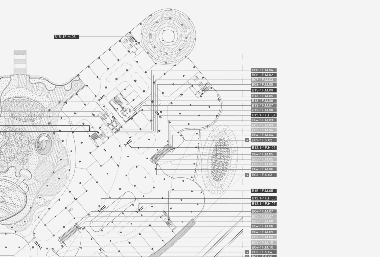
The placement plan behind Newman’s signage for Gaia Bumi Raya City Shopping Mall
Source: Newman Documentation
Most people think signage is simple. You put a name on a wall, an arrow on the floor, maybe a directory near the entrance, and call it a day. But if signage were that simple, no one would ever get lost in shopping malls, confused in office buildings, or frustrated in residential areas.
The truth is, signage has been guiding human movement long before we ever noticed it. From ancient markers carved in stone to today’s illuminated building signs in Jakarta, signage has always been about one thing: helping people make sense of space. And behind every sign that “just works” is a layer of science most people never see.


The concept and execution of The Cobbs Bistro material and lighting development.
Source: Newman Documentation
This is where Environmental Graphic Design comes in. It’s the discipline that sits between architecture, branding, and human behavior, covering signage, wayfinding, and placemaking as one connected system rather than separate tasks.
Let’s lightly lift the curtain and look behind the scenes!
It Starts With How Humans See and Move
Before a single sign is designed, its effectiveness is already shaped by human limitations. According to Signage and Wayfinding Design: A Complete Guide to Creating Environmental Graphic Design Systems by Chris Calori and David Vanden-Eynde, legibility depends on distance, speed, angle, and time available to read information.
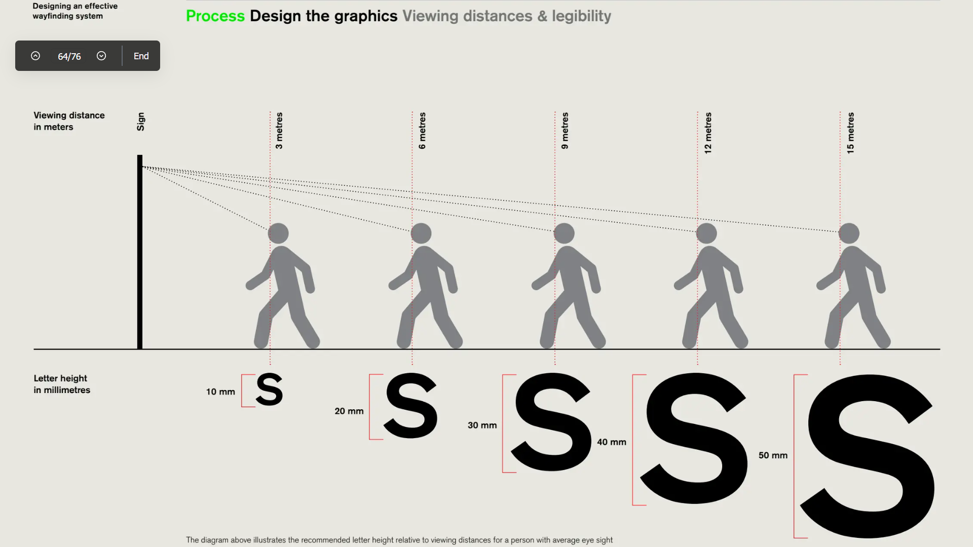
Distance, angle, and time to digest the information displayed matter in a functioning signage.
Source: Urbanite Documentation
This is why signage in pedestrian areas behaves very differently from signage along main roads or large retail corridors.
At a surface level, signage calculation considers:
- How far away will the sign be read from
- Whether people are walking, standing, or driving
- How much time do they have to process the information
This approach emphasizes that insufficient letter size or low contrast causes users to miss information entirely, even if the sign is technically “visible”.
In short, good signage respects human limits instead of fighting them.
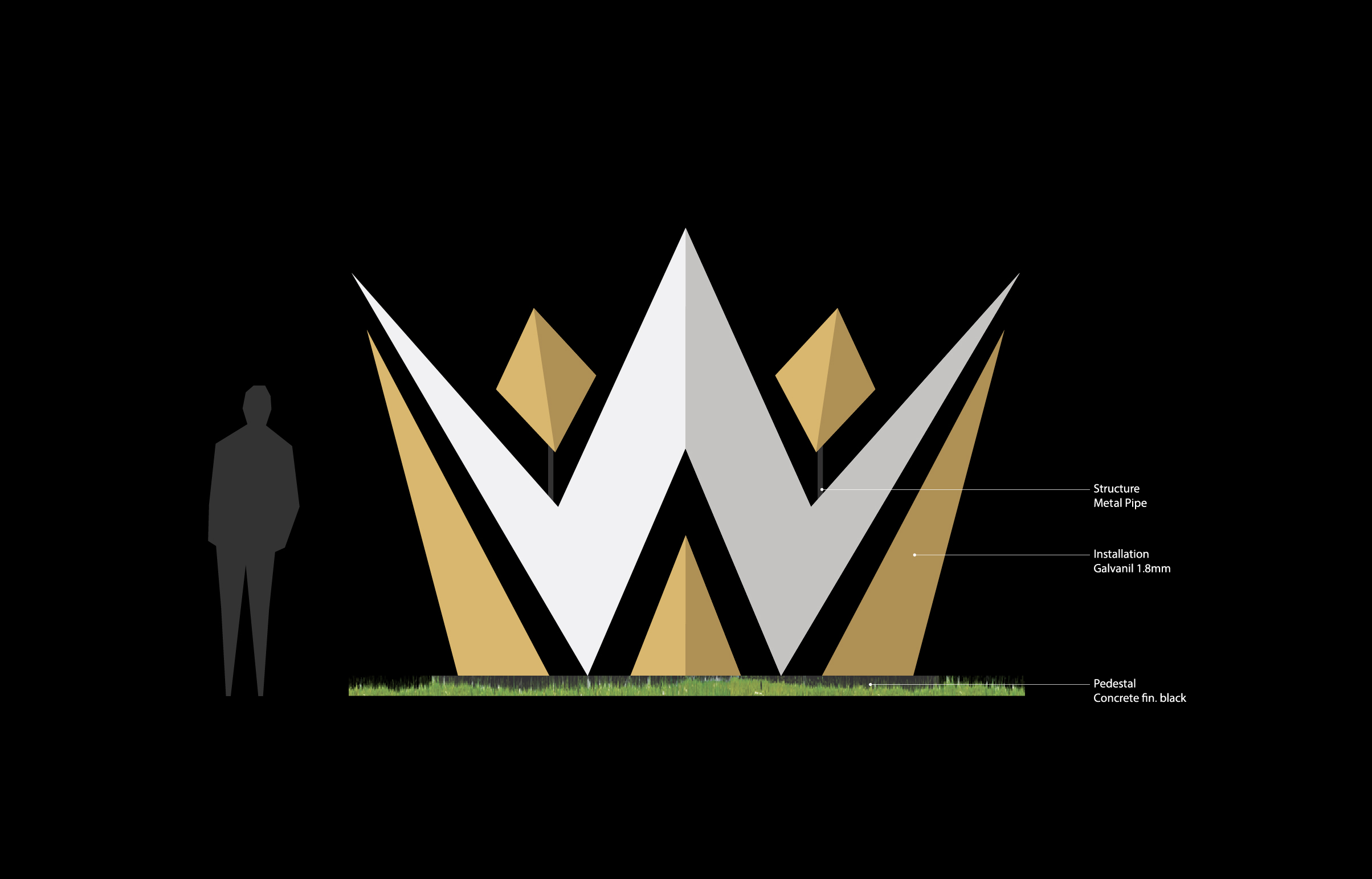
Comparison between Dewa United signage height and average human height for legibility reference.
Source: Newman Documentation
Designing Signage Is Designing a System
One of the biggest misconceptions is treating signage as individual objects. In reality, effective signage is always designed as a system, not standalone pieces.

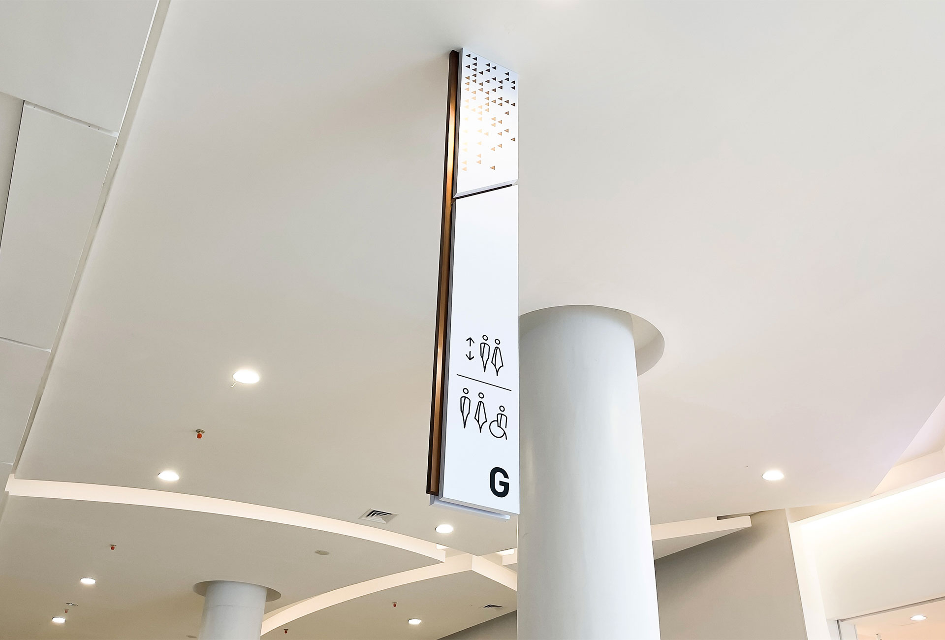
Newman’s signage system for Gaia Bumi Raya City Shopping Mall
Source: Newman Documentation
So, signage systems rely on hierarchy to function properly. Some signs announce where you are. Others guide movement. Others simply reassure you that you’re still going the right way.
Without this structure, users are forced to overthink simple actions. And once people start thinking too hard about navigation, the space has already failed them.
Consistency plays a major role here. Repeating visual elements such as typography, color, icons, and terminology allows users to recognize information faster over time. This is where branding enters the conversation. A strong brand system makes wayfinding clearer without adding more signs.
Placement Is About Timing, Not Quantity
If design is the language, placement is the delivery. Signage should appear at decision points, not before or after them. Entrances, intersections, changes in level, and moments of choice are where signs matter most.
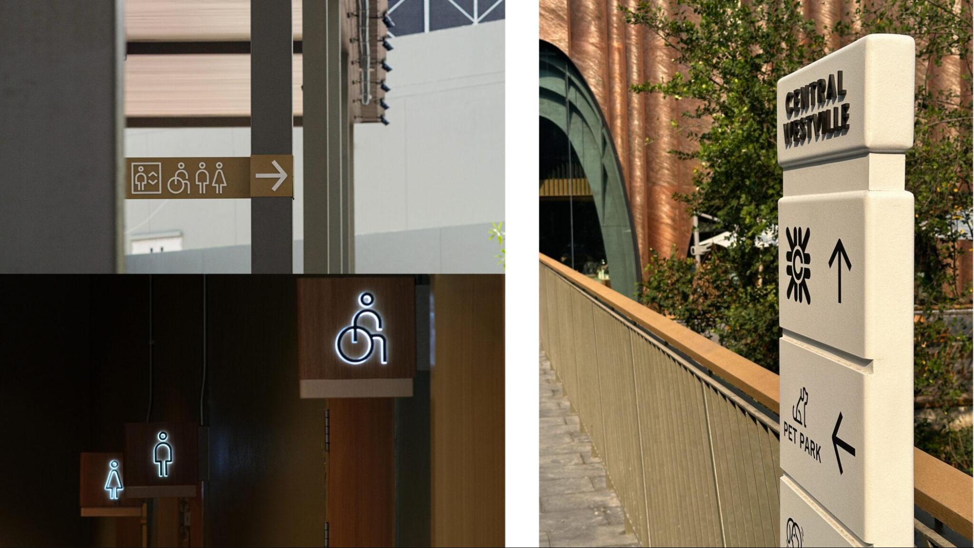
The placement of the signage near the bridge helps visitors make their decision on where to go next.
Source: Dinsor Documentation
At this level, placement considers:
- Eye level and natural sightline
- Lighting conditions throughout the day
- Visual competition with architecture or retail displays
Another often-overlooked element is reassurance signage. These signs don’t introduce new information. They simply confirm that you’re still on the right path. This reassurance reduces stress and improves user confidence in unfamiliar environments.
How Do You Know If Signage Works?

Good signage gives guidance while complementing and blending with its surroundings.
Source: Newman Documentation
Ironically, good signage is rarely noticed. No one stops to admire a perfectly placed directional sign. They just keep walking. And that’s exactly the point.
Its effectiveness shows up quietly, through behavior rather than applause. Designers usually read the room by observing a few simple things:
- Foot traffic that flows naturally, without people circling back like they missed something
- Navigation that feels intuitive, no phone maps, no “excuse me, where’s the exit?”
- Less time spent searching, more time actually enjoying the space
- Feedback that sounds like “this place is easy” rather than “this place is confusing”
If people move through a space without stopping to think about directions, congratulations. The signage has done its job and politely stayed out of the spotlight.
Why This Matters for Brands and Places
When signage, wayfinding, and placemaking work together, people don’t notice them individually. They simply feel comfortable, oriented, and connected to the space. That feeling becomes part of the brand experience.
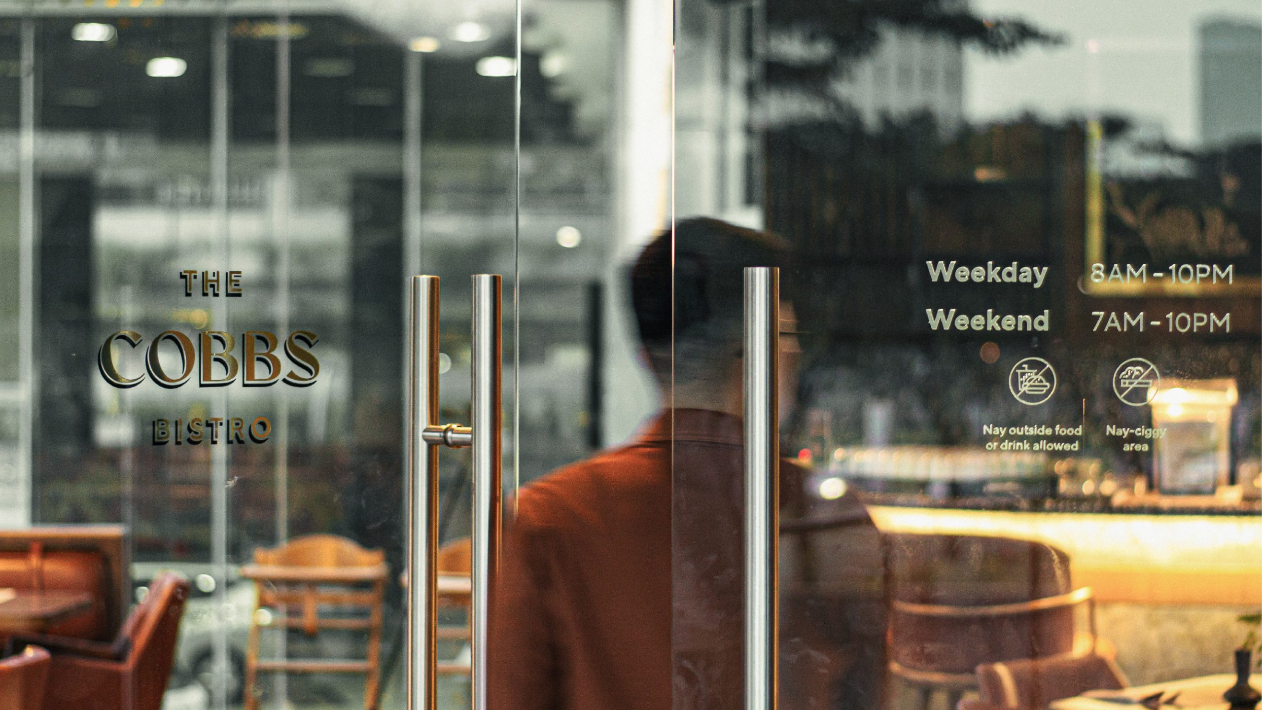
Comfortably connecting the brand, the experience, and the space is one of the important points of functioning signage.
Source: Newman Documentation
This is especially relevant in dense urban environments like Jakarta, where shopping malls, shophouse areas, residential clusters, and mixed-use developments compete not just for attention, but for clarity.
This is why at Newman we never treat signage as decoration. We approach it as part of a larger Environmental Graphic Design system, connecting brand identity, spatial logic, and real-world behavior. From The Cobbs Bistro to GAIA Shopping Mall signage, the goal is always the same: make spaces intuitive, expressive, and easy to navigate without making the visitor struggle.
Because the best signage doesn’t overcomplicate things, it simply works.