
Quick Navigate

Township of Smart Living
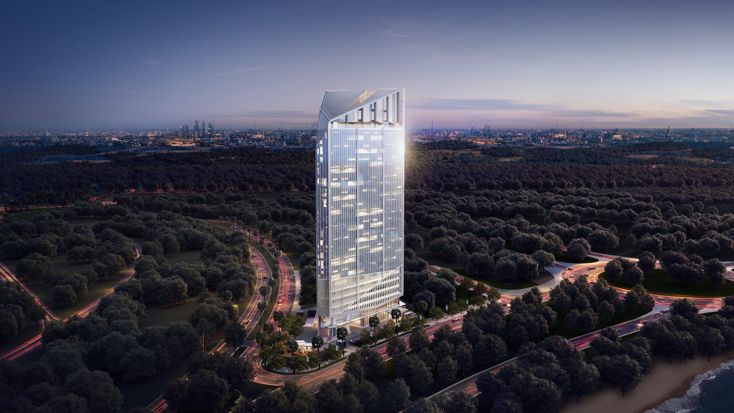
Sutera Nexen is Alam Sutera’s newest development with both residential and commercial area located in Balaraja, Tangerang aimed for the next generation of forward-thinkers and dream-chasers. Complemented with green area, swimming pool, playground, 3×3 basketball court, direct toll access, future MRT connection, and various smart technology features; this project is a special teamwork by Alam Sutera and Newman for the youngsters of Indonesia that long for a fun, modern, and smart living space as well as a profitable investment chance.
Client
PT Delta Mega Persada
Status
Completed — 2024
Discipline
Branding, Print, Signage
At its core, Sutera Nexen is a township built on the principles of smart living—a bold, future-ready space for a new society embracing digitalization and modernity
To bring this vision to life, we developed a branding and visual identity strategy designed to resonate deeply with Gen Z. Rooted in a tech-forward mindset supported by the pixel elements, our approach is both friendly and futuristic, encouraging trust and connection by speaking the language of young, digitally native audiences.
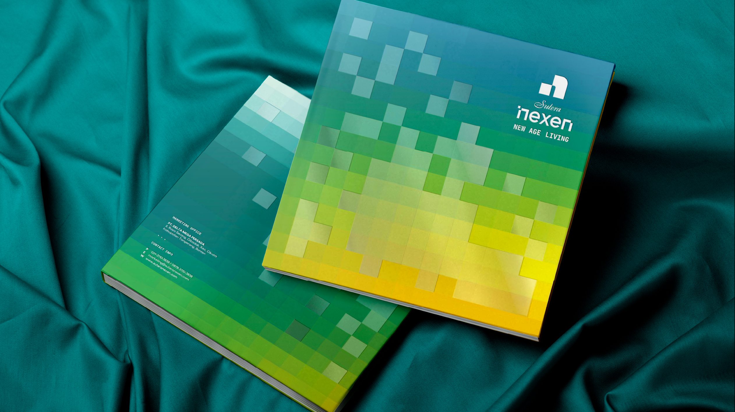
From a pixel to something bigger, this future-forward and smart living concept is brought further with our treatment for the visual identity. Each pixel represents the diverse individuals and communities that make up the township—young professionals, couples, families, and communities. As it grew, a logo made by pixels is revealed, a unification of many fractions to represent the township of young, energetic, and forward-thinking generations.

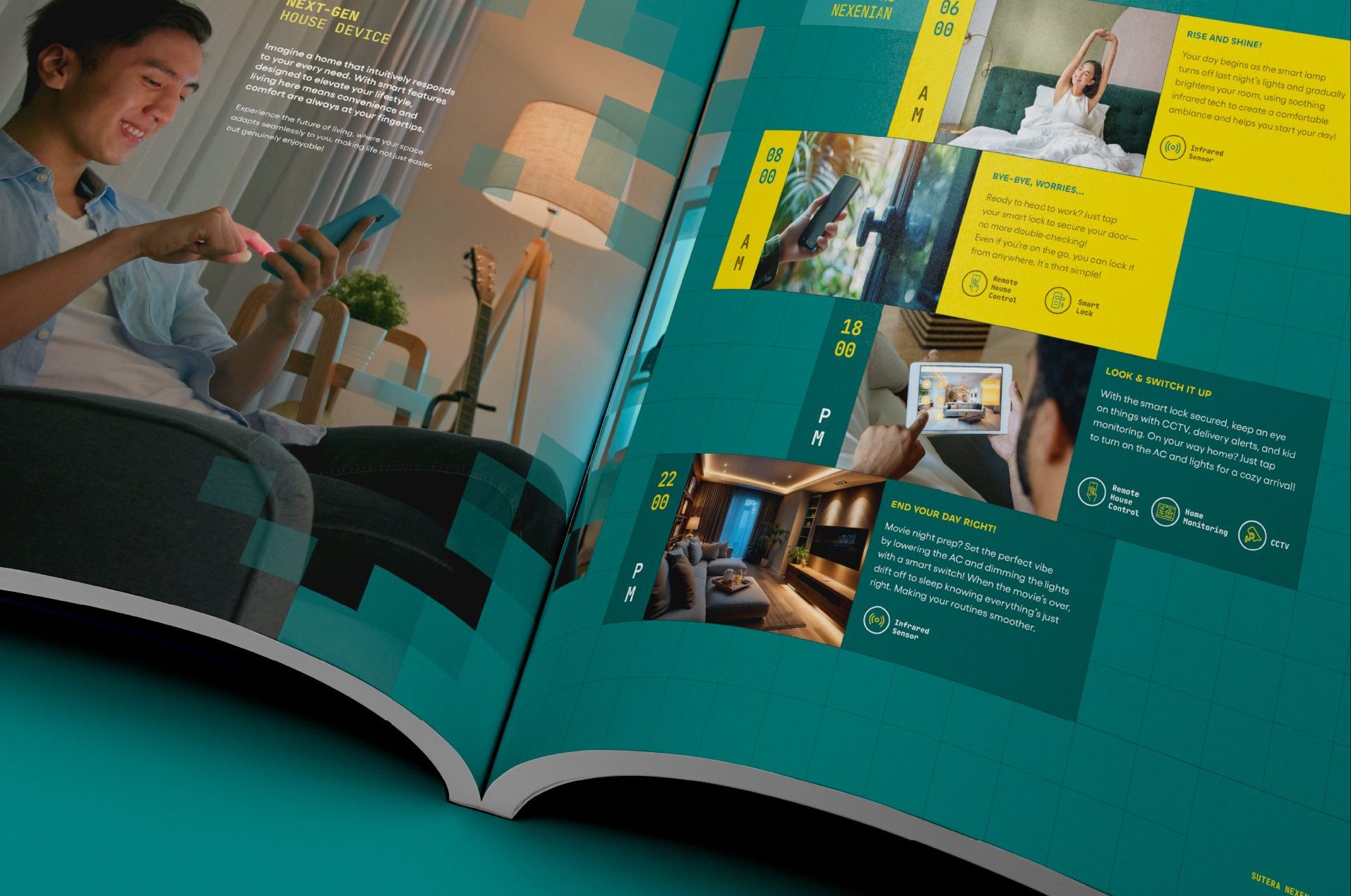
In the brand application, Nexen tried a different approach, getting close to the customers by a copywriting that feels like a friend and modern visual design that resonate with younger generation
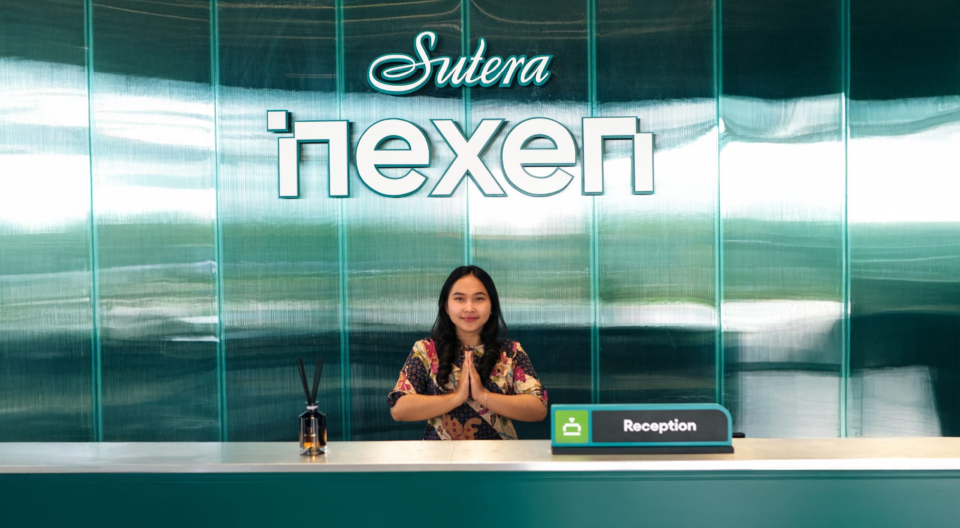
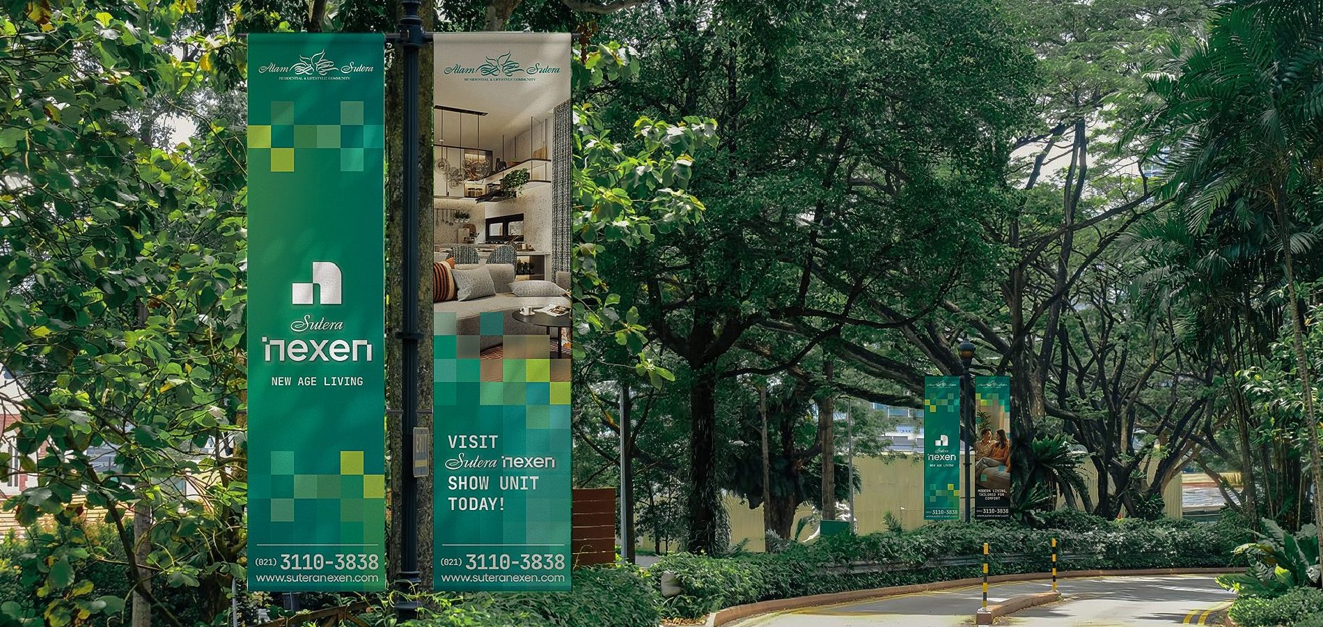
We made sure to make each of the marketing collaterals and brand application to follow the visual direction, using pixels as the supergraphic and iconography, vibrant colors, images of young people, and youthful copywriting with well-known slang and words that align well with the target market. From the smallest pixels to the large-scale billboards, we always ensure that everything is cohesive and connected.
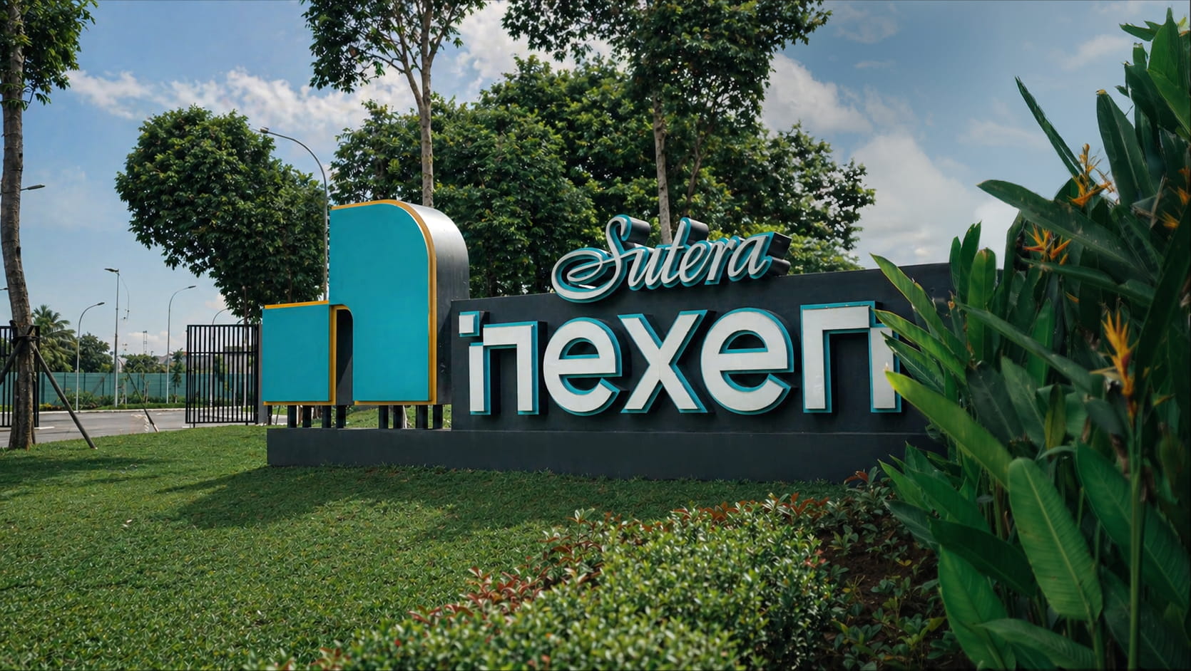
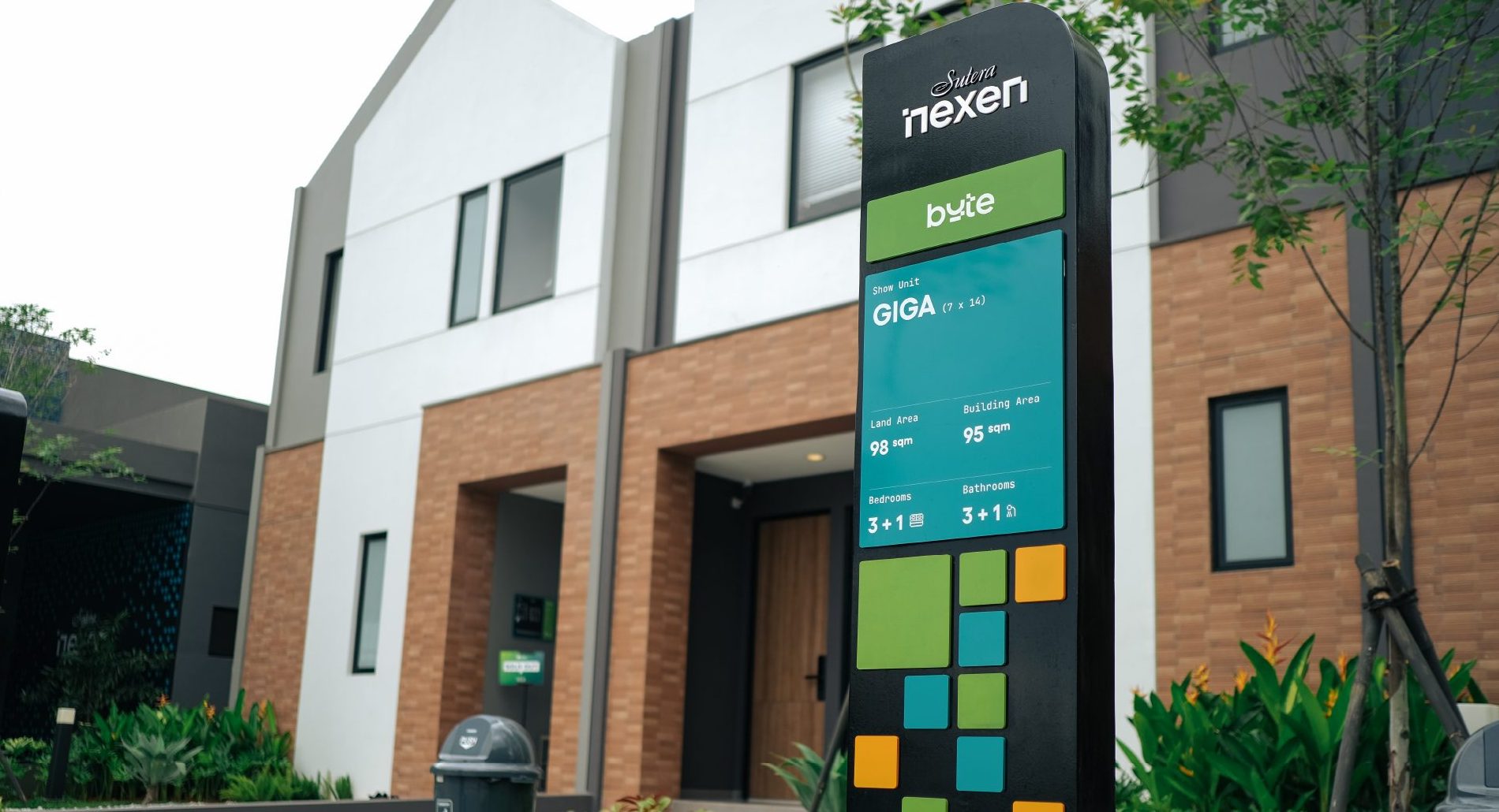
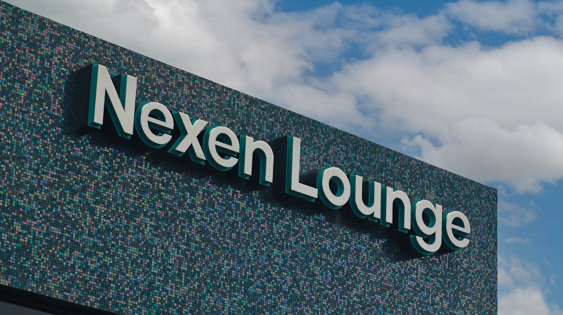
For Nexen’s signage, we chose durable galvanized steel, valued for its endurance and longevity. To enhance its modern appeal, we treated the material with a black textured base. Paired with pixel-inspired graphics and iconography designed with a blend of pixel precision and mathematical accuracy, the signage delivers clarity, functionality, and a bold visual identity that perfectly complements the development.