





Quick Navigate
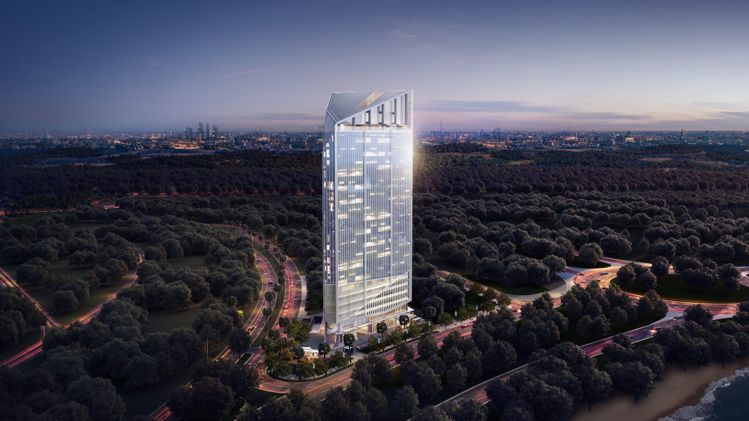
Ever wonder why some stores feel expensive before you’ve touched a single thing?
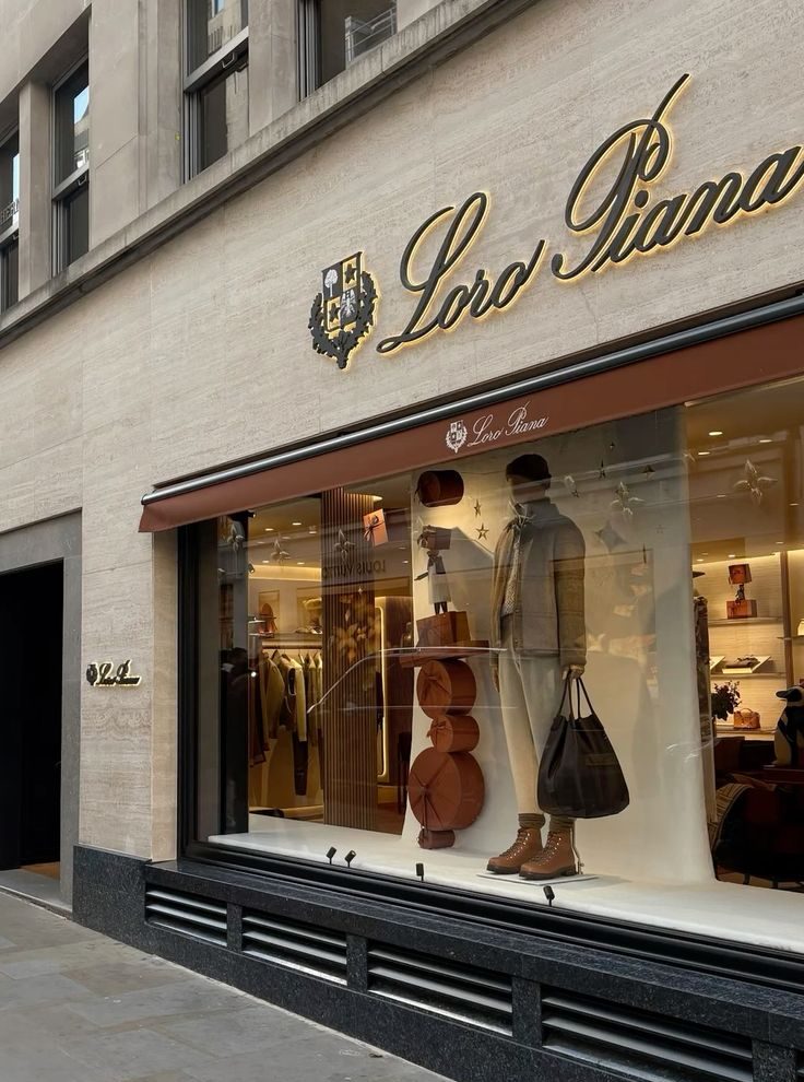
One of luxury fashion’s most understated storefronts.
Source: Loro Piana.
Have you ever walked past a store that instantly caught your eye, and somehow you already knew it was a premium brand?
You haven’t stepped inside, you haven’t looked at a single product. But somehow, you already have an idea of what the brand is like.
Maybe it’s the colours? The signage?The typography? Or maybe it’s just how everything comes together?
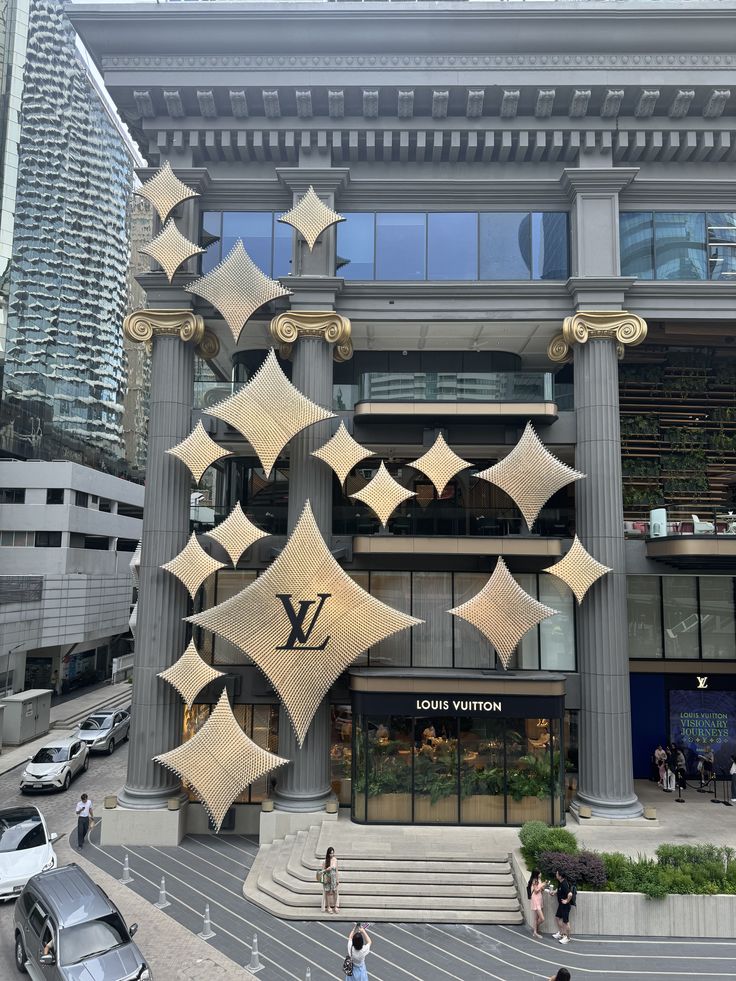
The Louis Vuitton Bangkok flagship showcases how architecture can elevate a brand’s presence beyond traditional signage.
Source: Louis Vuitton
The funny thing is, most of us don’t even realise we’re making these assumptions. We just know when a place feels polished, thoughtfully designed, or simply… premium.
And that’s exactly the point!
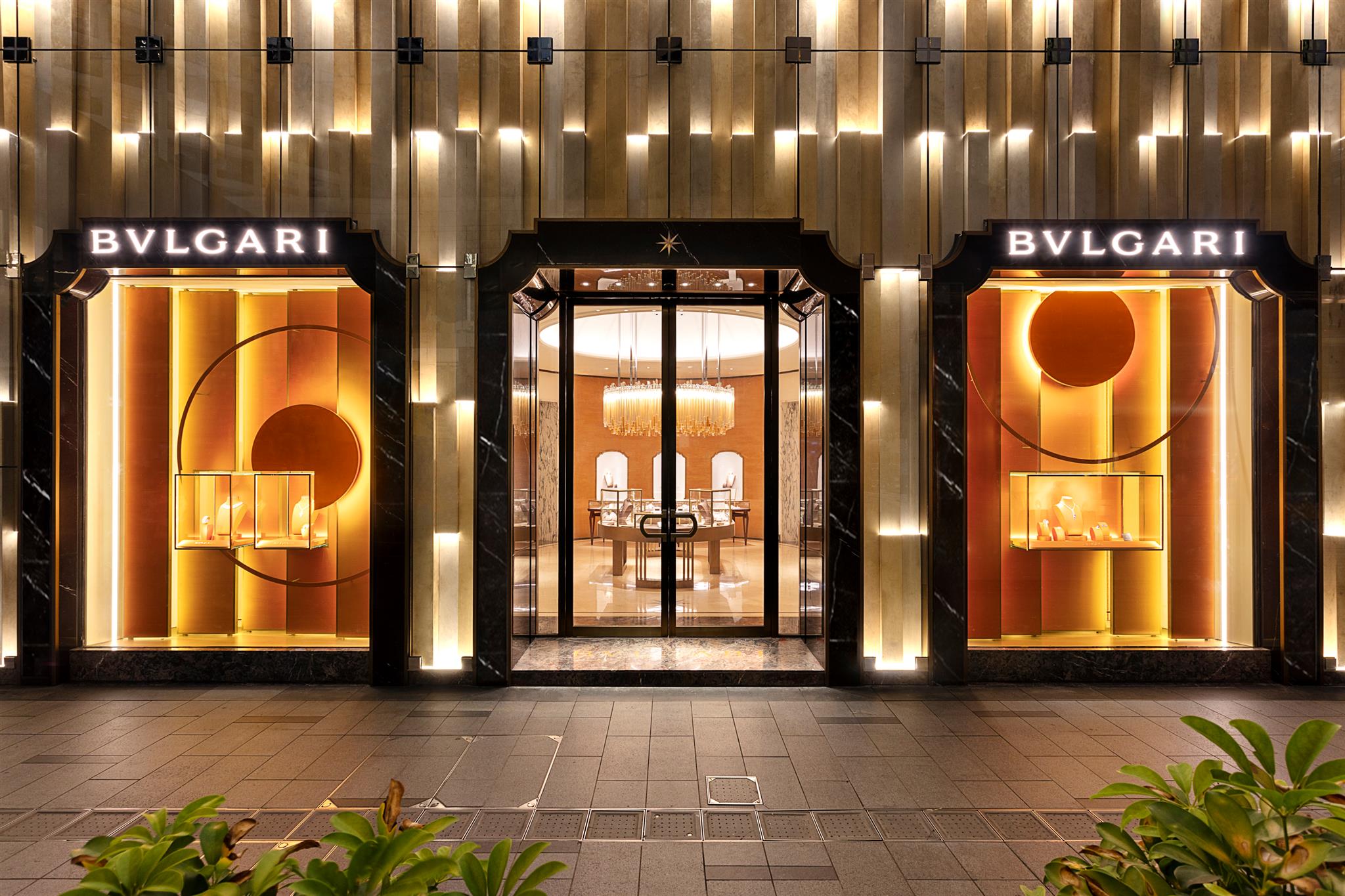
Long before someone walks through the door, a brand has already started telling its story. Every little detail, from the sign outside to the colours, materials, and even the spacing between letters, plays a part in shaping that first impression.
So, what is it that makes some brands feel premium before you’ve even stepped inside? Let’s break it down.
1. The Art of Holding Back!
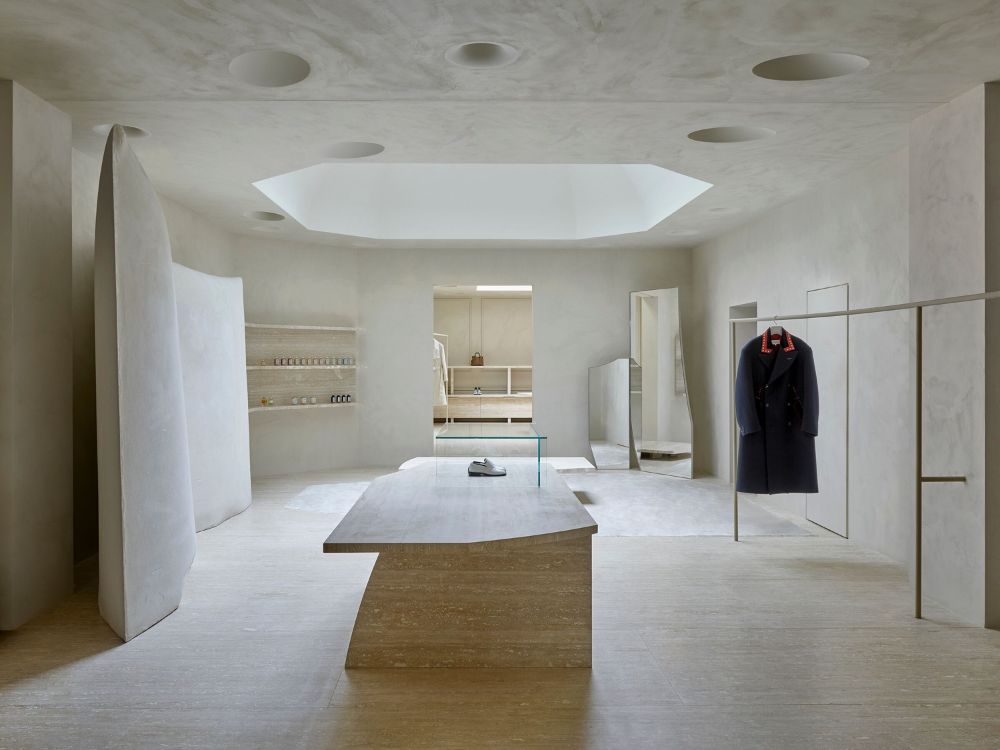
Maison Margiela Store, Less visual noise creates a stronger sense of refinement.
Source: Superfuture
Funny how the stores saying the least are often the hardest to ignore, isn’t it?
Instead of filling every inch with something to look at, they leave room for the details that actually matter. That’s what makes them feel confident, not crowded.
2. Even Font Have Personalities
Think about it, would the same luxury boutique feel as refined if its signage used a playful, rounded font? Probably not, right? Hence, every typeface has its own personality. Some feel modern and clean. Others feel timeless and elegant. Even if customers can’t name the font, they notice how it makes them feel.
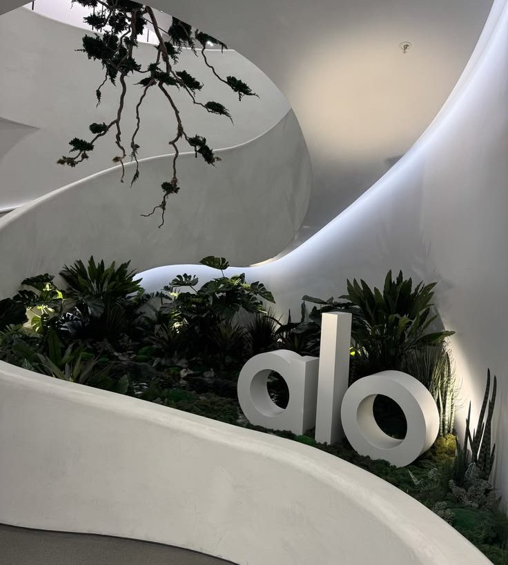
Alo’s London Flagship, A carefully chosen typeface helps make a brand more memorable.
Source: Alo London
When it’s done right, everything simply feels more put together.
3. Details Matter
Something that almost everyone misses when looking at a great storefront… Can you guess what it is? Most people notice the sign or maybe the lighting, some might even remember the colours.
But very few notice how all of those elements work together. No single detail steals the spotlight, and that’s exactly why the whole experience feels so effortless.
Signage, typography, colours, lighting, and materials all have different roles, but none of them should compete for attention. Instead, they should work together to create one crystal clear impression.
4. The “Sign” Is Right There
Ever wondered why it’s called signage? Because it’s literally the sign people see before anything else!
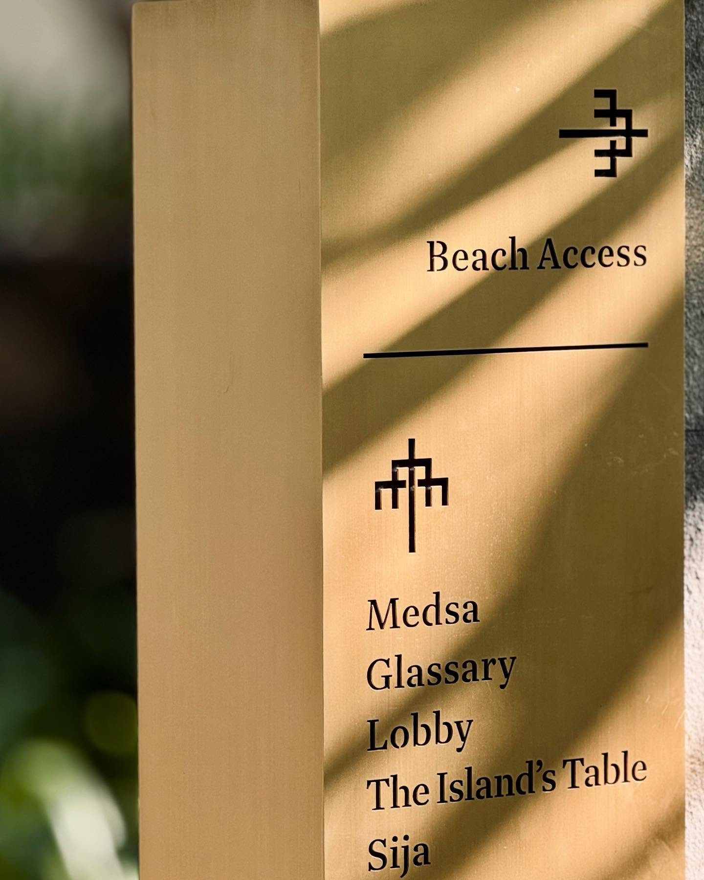
Wayfinding that seamlessly integrates with the resort’s visual identity.
Source: Newman Project Documentation
Your sign is often the very first introduction. It tells people whether your brand feels modern or timeless, playful or refined, approachable or exclusive. And once that first impression is made, everything else is seen through that lens.
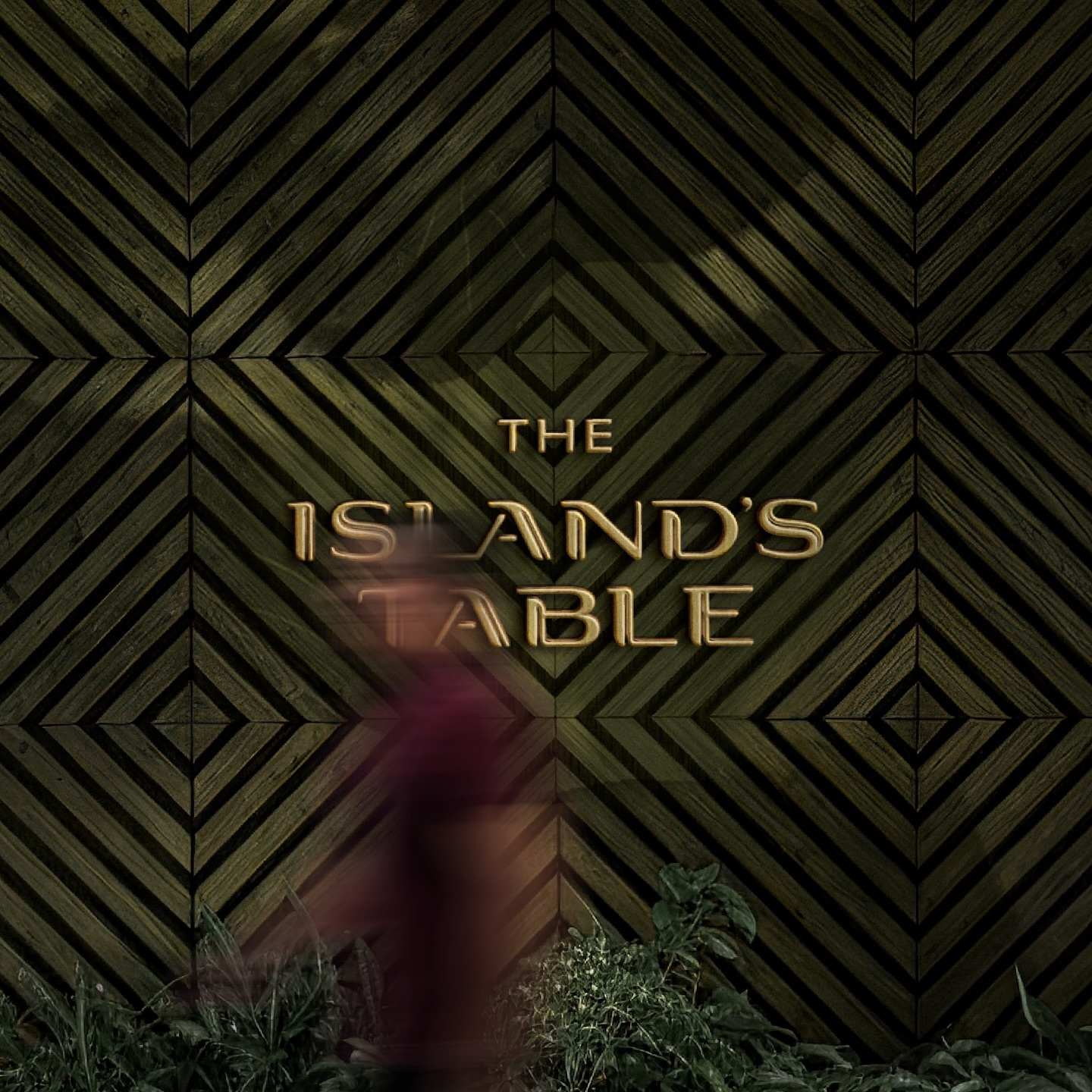
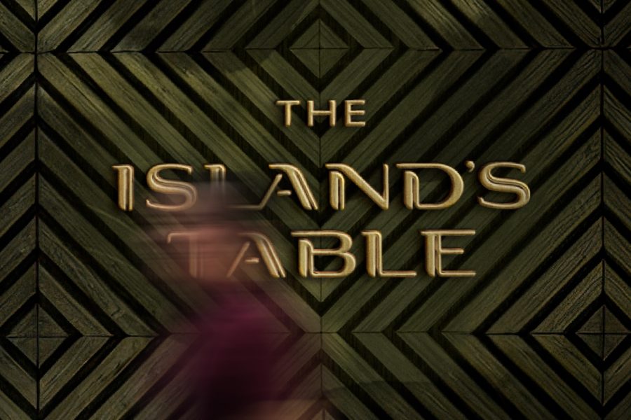
Signage designed by Newman for the all-day dining, The Island’s Table, at SIRA Lombok.
Source: Newman Project Documentation
The truth is, people start forming an impression long before they step inside. It all begins with your storefront.
At Newman, we believe branding doesn’t end with a logo. It extends into every touchpoint people experience, from brand identity and signage to wayfinding systems that help businesses communicate who they are, and most importantly, connect with the right audience, and leave lasting first impressions.